Visualization
This guide explains how to visualize water distribution networks using the
ScenarioVisualizer class.
The ScenarioVisualizer class allows for
generating plots, animations and customizations, according to the
ScadaData generated by the
ScenarioSimulator.
Setup and basic visualization
In order to setup a new ScenarioVisualizer
instance, we first have to create a new
ScenarioSimulator instance.
The ScenarioSimulator instance is then provided
to the ScenarioVisualizer.
# Load a network configuration and create a ScenarioSimulator with it
network_config = load_anytown(verbose=False)
with ScenarioSimulator(scenario_config=network_config) as wdn:
    # Create a ScenarioVisualizer object and show the network topology plot
    vis = ScenarioVisualizer(wdn)
    vis.show_plot()
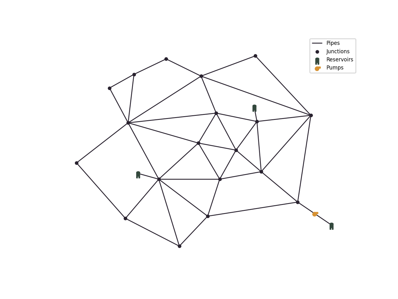
The show_plot() method
visualizes the network:
Note
Alternatively, you can use the
plot_topology() function of
a ScenarioSimulator instance.
Customization
The hydraulic components can be colored according to the simulation results by calling the corresponding methods:
The ScadaData is generated inside the methods
using the provided ScenarioSimulator instance
from initialization, but it can also be set explicitly by setting the scada_data attribute.
The two main arguments for customization are called parameter and statistic. Parameter refers to which data to use for coloring and the statistic refers to the processing of that data. Both are supplied as string.
The parameter options depend on the hydraulic component and are listed with their data source in the following table:
Node parameter |
Corresponding data source |
|---|---|
pressure |
|
demand |
|
node_quality |
Link parameter |
Corresponding data source |
|---|---|
flow_rate |
|
link_quality |
|
diameter |
Pump parameter |
Corresponding data source |
|---|---|
efficiency |
|
energy_consumption |
|
state |
Tank parameter |
Corresponding data source |
|---|---|
default |
Valve parameter |
Corresponding data source |
|---|---|
default |
Note
In the case, that the sensor data (instead of raw data) should be visualized, the parameter use_sensor_data should be set to True. The sensor values may include sensor faults or noise and are only available when there is a corresponding sensor attached to the component, if that is not the case, the component is displayed using its default color.
The statistic decides how the simulation data over time is processed to one value which can be displayed. It has the following options:
mean
min
max
time_step
If time_step is selected, the point in time must be provided via the pit parameter.
Note
Example: When calling
color_nodes() with the
parameter pressure and the statistic max, each node in the network is colored according
to its maximum pressure value during the simulation time.
Here are two examples:
# Load a network configuration and create a ScenarioSimulator with it
network_config = load_anytown(verbose=False)
with ScenarioSimulator(scenario_config=network_config) as wdn:
    vis = ScenarioVisualizer(wdn, color_scheme=black_colors)

    # Color nodes according to the pressure at time step 8
    vis.color_nodes(parameter='pressure', statistic='time_step', pit=8,
                    colormap='autumn', show_colorbar=True)
    vis.show_plot()

# Load a network configuration and create a ScenarioSimulator with it
network_config = load_anytown(verbose=False)
with ScenarioSimulator(scenario_config=network_config) as wdn:
    vis = ScenarioVisualizer(wdn, color_scheme=black_colors)

    # Color the pumps according to the maximum energy consumption during the simulation time
    vis.color_pumps(parameter='energy_consumption', statistic='max',
                    show_colorbar=True)

    # Color the links according to the mean flow rate
    vis.color_links(parameter='flow_rate', statistic='mean',
                    show_colorbar=True)

    vis.show_plot()

If show_colorbar is true, a colorbar is generated and displayed in the plot.
The black_colors color scheme sets all hydraulic components’ default color to black.
Method calls can be combined to adjust multiple components before rendering, such that each component is colored according to the given parameter and statistic. If multiple calls to the same component are made, only the last call is valid.
Further customization options are the following:
colormap: The colormap defines the range of colors used for displaying high and low values. It can be provided as an argument. The options are matplotlib.colors.Colormap names, such as ‘viridis’, ‘coolwarm’ or ‘autumn’.
hide_nodes(): It is possible to hide the nodes by calling the methodhide_nodes()resize_links(): Links can also be sized according to a parameter and statistic by calling the functionresize_links(). It can be called independently tocolor_links()and they can be combined.
Animation
It is possible to animate the values over the time steps. For this, the following 3 steps are necessary:
Set the statistic to ‘time_step’
Set the pit to a tuple of two values: (start_time_step, end_time_step)
Call
show_animation()instead ofshow_plot()
This code shows an animation of the links by coloring and sizing them using generated custom data over time. The pit (0, -1) animates all available time steps.
# Load a network configuration and create a ScenarioSimulator with it
network_config = load_anytown(verbose=False)
with ScenarioSimulator(scenario_config=network_config) as wdn:
    # Generate custom data for better demonstration
    timesteps = 50
    links = 41
    t = np.linspace(0, 2 * np.pi, timesteps)

    frequencies = np.linspace(1, 3, links)
    phases = np.linspace(0, np.pi, links)
    amplitudes = np.linspace(0.5, 1.5, links)

    custom_data_table = np.array([a * np.sin(f * t + p) for f, p, a in
                                zip(frequencies, phases, amplitudes)]).T

    # Create new ScenarioVisualizer with black color scheme
    vis = ScenarioVisualizer(wdn, color_scheme=black_colors)

    # Visualize the custom data from time step 0 to the last time step (-1) as
    # link color and link size
    vis.color_links(data=custom_data_table, parameter='custom_data',
                    statistic='time_step', pit=(0, -1))
    vis.resize_links(data=custom_data_table, parameter='custom_data',
                     statistic='time_step', pit=(0, -1), line_widths=(1, 3))

    # Hide the nodes such that only the links remain visible
    vis.hide_nodes()
    vis.show_animation()
Saving the visualization
The generated plots can be saved by setting the export_to_file argument with the desired filename. The file type must be compatible with matplotlib (e.g. .png, .jpg for images, .mp4 for videos).
vis.show_plot(export_to_file='network_plot.png')
The same argument exists for the animation:
vis.show_animation(export_to_file='network_animation.mp4')
In order to display the animation in a jupyter notebook, the
FuncAnimation instance can be returned and displayed like this:
from IPython.display import HTML

# Create a FuncAnimation object
anim = vis.show_animation(return_animation=True)
# Display animation in jupyter notebook
HTML(anim.to_jshtml())