Visualization Example
[1]:
from IPython.display import display, HTML
display(HTML('<a target=\"_blank\" href=\"https://colab.research.google.com/github/WaterFutures/EPyT-Flow/blob/main/docs/examples/visualization.ipynb\"><img src=\"https://colab.research.google.com/assets/colab-badge.svg\" alt=\"Open In Colab\"/></a>'))
This example demonstrates the usage of the visualization class in order to plot network topology and simulation data per hydraulic component.
[2]:
%pip install epyt-flow --quiet
Note: you may need to restart the kernel to use updated packages.
[3]:
from epyt_flow.data.networks import load_anytown
from epyt_flow.simulation import ScenarioSimulator
from epyt_flow.visualization import ScenarioVisualizer
Load Anytown network by calling load_anytown():
[4]:
network_config = load_anytown(verbose=False)
Create a dummy ScenarioSimulator:
[5]:
wdn = ScenarioSimulator(scenario_config=network_config)
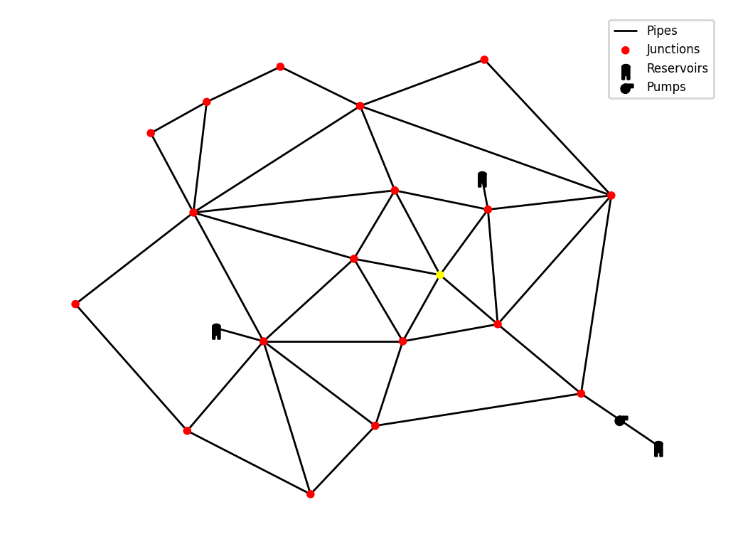
Plot the network by creating a new ScenarioVisualizer object and calling show_plot() :
[6]:
vis = ScenarioVisualizer(wdn)
vis.show_plot()

The hydraulic components can be colored according to the simulation results by calling the corresponding functions: color_nodes(), color_links() , color_pumps() , color_tanks() and color_valves() . The parameters (e.g. pressure, diameter) are component specific and can be found in the function documentation. The statistic options are the same for the different components and include mean, min, max and time_step. When using the values at a certain timestep, a point in time must be given through the pit parameter.
This example shows the nodes in this function colored according to the pressure at timestep 8.
[7]:
vis = ScenarioVisualizer(wdn)
vis.color_nodes(parameter='pressure', statistic='time_step', pit=8,
colormap='autumn', show_colorbar=True)
vis.show_plot()

Additionally to the color_links() method, it is possible to resize the links according to a parameter. Multiple manipulations can be applied to the same graph at once. If several calls are made to color the same hydraulic component, only the last call is valid.
[8]:
vis = ScenarioVisualizer(wdn)
vis.color_links(parameter='flow_rate', statistic='mean', show_colorbar=True)
vis.resize_links(parameter='flow_rate', statistic='mean')
vis.hide_nodes()
vis.show_plot()

In order to apply a certain color scheme do all hydraulic components that are not affected by method calls, import the color scheme and apply it when creating the ScenarioVisualizer.
[9]:
from epyt_flow.visualization import epanet_colors, black_colors
vis = ScenarioVisualizer(wdn, color_scheme=epanet_colors)
vis.show_plot()

The colors applied to a component don’t have to be continuous. It is possible to either supply an amount of intervals the components should be grouped into by using intervals=3 or to custom divide them by supplying the borders through intervals=[-100, 0, 100].
Conversions to different units can also be applied by using a dictionary containing the required epyt-flow conversion units.
[10]:
vis = ScenarioVisualizer(wdn, color_scheme=black_colors)
vis.color_nodes(parameter='demand', statistic='time_step', pit=0,
colormap='autumn', intervals=3, conversion={"flow_unit": 8})
vis.show_plot()
[11]:
vis = ScenarioVisualizer(wdn, color_scheme=black_colors)
vis.color_links(parameter='flow_rate', statistic='max', colormap='autumn',
intervals=[-100, 0, 100, 200])
vis.hide_nodes()
vis.show_plot()

The colormap can be adjusted by providing a matplotlib colormap as a parameter.
[12]:
vis = ScenarioVisualizer(wdn, color_scheme=black_colors)
vis.color_links(parameter='diameter', colormap='Blues')
vis.resize_links(parameter='diameter', line_widths=(1, 3))
vis.hide_nodes()
vis.show_plot()

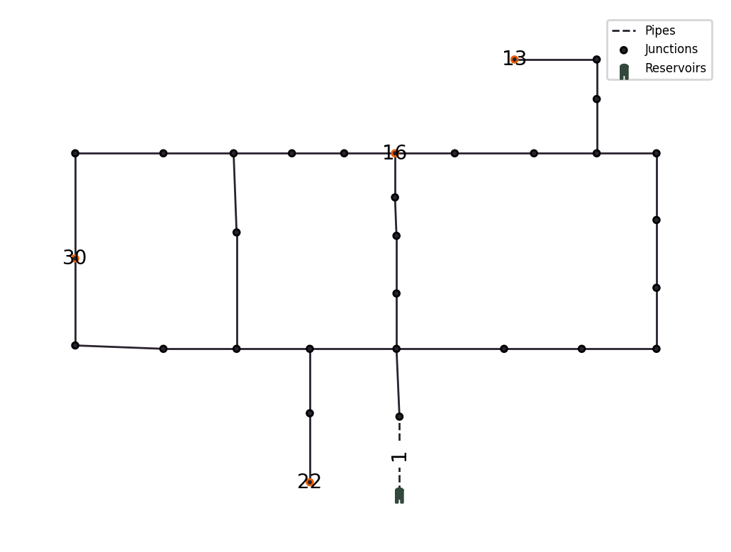
Components can be labeld by calling add_labels(). The labels can be added for the sensor_config (see below), for all components via 'all' or for certain components by using a list of the components names which should be labeled: ['nodes', 'tanks', 'reservoirs', 'pipes', 'valves', 'pumps'].
[13]:
from epyt_flow.data.networks import load_hanoi
from epyt_flow.visualization import epyt_flow_colors
network_config_sc = load_hanoi(verbose=False,
include_default_sensor_placement=True)
wdn_sc = ScenarioSimulator(scenario_config=network_config_sc)
vis = ScenarioVisualizer(wdn_sc, color_scheme=epyt_flow_colors)
vis.highlight_sensor_config()
vis.add_labels('sensor_config', font_size=10)
vis.show_plot()
wdn_sc.close()
Given a set of sensor applied to a water distribution network, it is possible to use the sensor data (instead of the raw simulation data) for visualization. Sensors may differ in values to the raw data due to sensor faults or noise. To do this, set the use_sensor_data flag to True, when coloring a component:
[14]:
network_config = load_hanoi(verbose=False, include_default_sensor_placement=False)
wdn_sc = ScenarioSimulator(scenario_config=network_config)
wdn_sc.set_pressure_sensors(['5', '25', '17', '20', '11'])
vis = ScenarioVisualizer(wdn_sc, color_scheme=black_colors)
vis.color_nodes(parameter="pressure", use_sensor_data=True)
vis.add_labels('sensor_config', font_size=10)
vis.show_plot()
wdn_sc.close()

Note that in this case, the pressure can only be shown for nodes that have a pressure sensor attached to them.
Animations
It is possible to do an animation of the timestep values over an interval in time. For this, the point in time (pit) parameter must be provided as a tuple of the start and end values. Further, instead of calling show_plot() , show_animation() must be selected. If a file_path (anim.gif) is provided through the export_to_file parameter, the resulting animation is saved.
[15]:
from IPython.display import HTML
vis = ScenarioVisualizer(wdn, color_scheme=black_colors)
vis.color_links(parameter='flow_rate', statistic='time_step', pit=(0, 40))
vis.resize_links(parameter='flow_rate', statistic='time_step', pit=(0, 40),
line_widths=(1, 3))
vis.hide_nodes()
anim = vis.show_animation(return_animation=True)
HTML(anim.to_jshtml())
[15]:
<Figure size 640x480 with 0 Axes>
It is also possible to use custom data, instead of generated scada data, to visualize behaviour. In this example, periodic flow rates are animated over time. The necessary dimensions for the custom data are: time_steps x links. For other hydraulic components, it would be: time_steps x hydraulic_components.
[16]:
import numpy as np
# Generate custom data for better demonstration
timesteps = 50
links = 41
t = np.linspace(0, 2 * np.pi, timesteps)
frequencies = np.linspace(1, 3, links)
phases = np.linspace(0, np.pi, links)
amplitudes = np.linspace(0.5, 1.5, links)
custom_data_table = np.array([a * np.sin(f * t + p) for f, p, a in
zip(frequencies, phases, amplitudes)]).T
# Create new ScenarioVisualizer with black color scheme
vis = ScenarioVisualizer(wdn, color_scheme=black_colors)
# Visualize the custom data from time step 0 to the last time step (-1) as
# link color and link size
vis.color_links(data=custom_data_table, parameter='custom_data',
statistic='time_step', pit=(0, -1))
vis.resize_links(data=custom_data_table, parameter='custom_data',
statistic='time_step', pit=(0, -1), line_widths=(1, 3))
# Hide the nodes such that only the links remain visible
vis.hide_nodes()
anim = vis.show_animation(return_animation=True)
HTML(anim.to_jshtml(fps=15))
[16]: